Lunessence Winery & Vineyard
Building the foundation for a new legacy of wine in the Okanagan Valley.
Overview
Following the acquisition of what was formerly known as Sonoran Winery, Lunessence was in need of a rebrand to find its own identity and footing in the wine business.
Despite numerous attempts in working with others designers to help craft a brand that hit the right note, the owners we not able to find what they were looking for. That's where we came into the picture—to help perform creative exploration and build their brand from the ground up.
- Brand strategy
- Logo design
- Visual identity
- Package design
- Web design
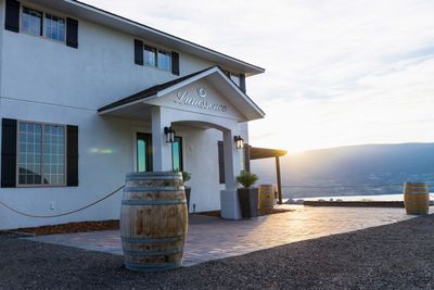
Planting new roots
After sitting down to discuss the vision that the owners had for the winery, we settled on renaming it to Lunessence Winery & Vineyard. With the intention of keeping the new Lunessence brand anchored to a lunar motif, a fluid crescent contour logomark was produced to express the romance of wine. All further brand elements were created with the aforementioned as our guiding star.
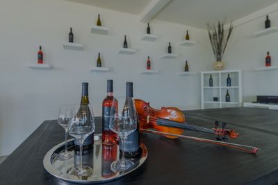
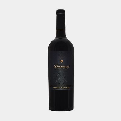
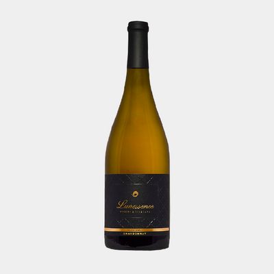
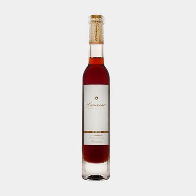
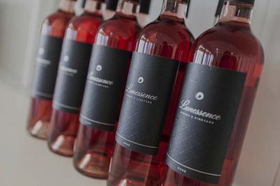
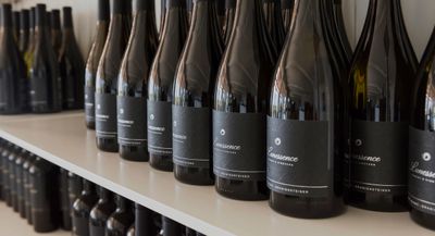
Proud expressions of the earth
It was during the product packaging design phase that we sought to marry tranditional styles of design with modern. While it was crucial that a classic tone was captured, it was equally important to be able to establish firm footing in a region highly saturated in the production of wine.
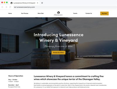
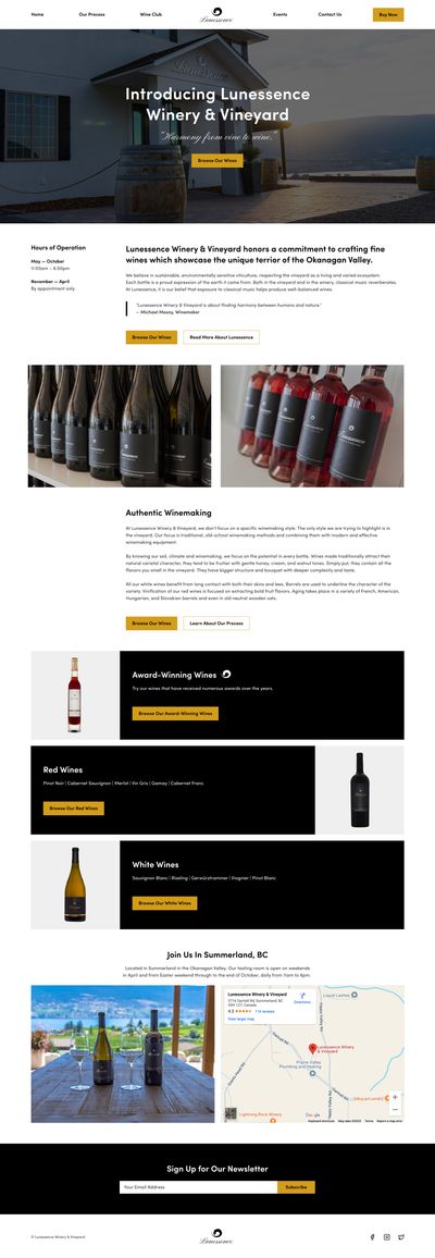
A digital stepping stone
Although the current live website has changed a number of times, we helped lay the initial web design foundation for Lunessence, ultimately serving as a jumping point to expand upon.
Let's design
your next step.
Every business has different needs. At kthus designs, we can help you develop a plan to boost your brand's presence with a website that's purpose-built for the journey you're on.